Dynamically Resizing Text with jQuery
Dynamically resized text ensures that when necessary, text can fit to a pixel-perfect width in any browser and any operating system. While fonts are similar enough across most browsers and OS, in headlines or other locations where overflow text would break layout, occasionally, one browser will have issues where otheres don’t. In this case, we can ensure that all browsers work at once with a little jQuery.
The demo is made of three snippets:
The HTML:
<div id="demo">
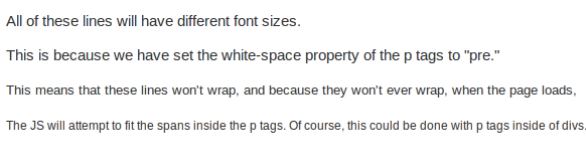
<p>All of these lines will have different font sizes.</p>
<p>This is because we have set the white-space property of the p tags to "pre."</p>
<p>This means that these lines won't wrap, and because they won't ever wrap, when the page loads,</p>
<p>The JS will attempt to fit the spans inside the p tags. Of course, this could be done with p tags inside of divs.</p>
</div>The CSS:
#demo p{
  white-space:pre;
}

#demo {
  width:600px;
}
And the JS magic that fits a span into every p tag and then scales the font by percents.
<br />